GPT-6 Interactive Answers Can Carry a Submit Button: Keep an Answer-Surface UI Register
ChatGPT's Intelligent UI puts forms and buttons inside answers. Classify every rendered control, gate the ones that act, log them, re-run when defaults flip.

Go deeper. Build your own.
Free ChatGPT accounts start getting answers with forms in them as the rollout reaches them from Oct 8. Nobody at your company filed a change request for that, because nothing in your stack changed. The vendor’s default did, and the default now decides whether an answer is a paragraph, a chart, or a set of fields with a button under them.
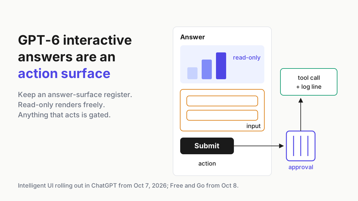
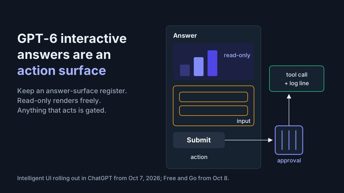
That is the operator problem inside GPT-6 interactive answers. A chart is something you read. A form is something you fill in, and a button is something that does a thing when pressed. Once an assistant can compose its reply out of all three, the reply is an action surface, and an approval policy written for typed tool calls has a gap the exact shape of a widget.
The move this week is an answer-surface UI register with a component allowlist: one row per assistant surface you run, the element classes it renders, whether anything that acts goes through the same gate as a typed tool call, and whether you can prove later what the person saw. The rule fits on one line. Read-only components are allowed everywhere; input and action components need an approval path and a log line.
What OpenAI shipped on Oct 7: Intelligent UI, and no developer hook
The feature is called Intelligent UI. “Interactive answers” is how OpenAI describes it, not its name. OpenAI’s developer-community announcement, posted Oct 7, 2026, says Intelligent UI “delivers fast, interactive answers” and that GPT-6 “can now compose responses using text, visuals, and interactive elements, choosing how they fit together based on your question.” The system card, “GPT-6 Sol and GPT-6 Luna: October 2026 update,” carries the same date.
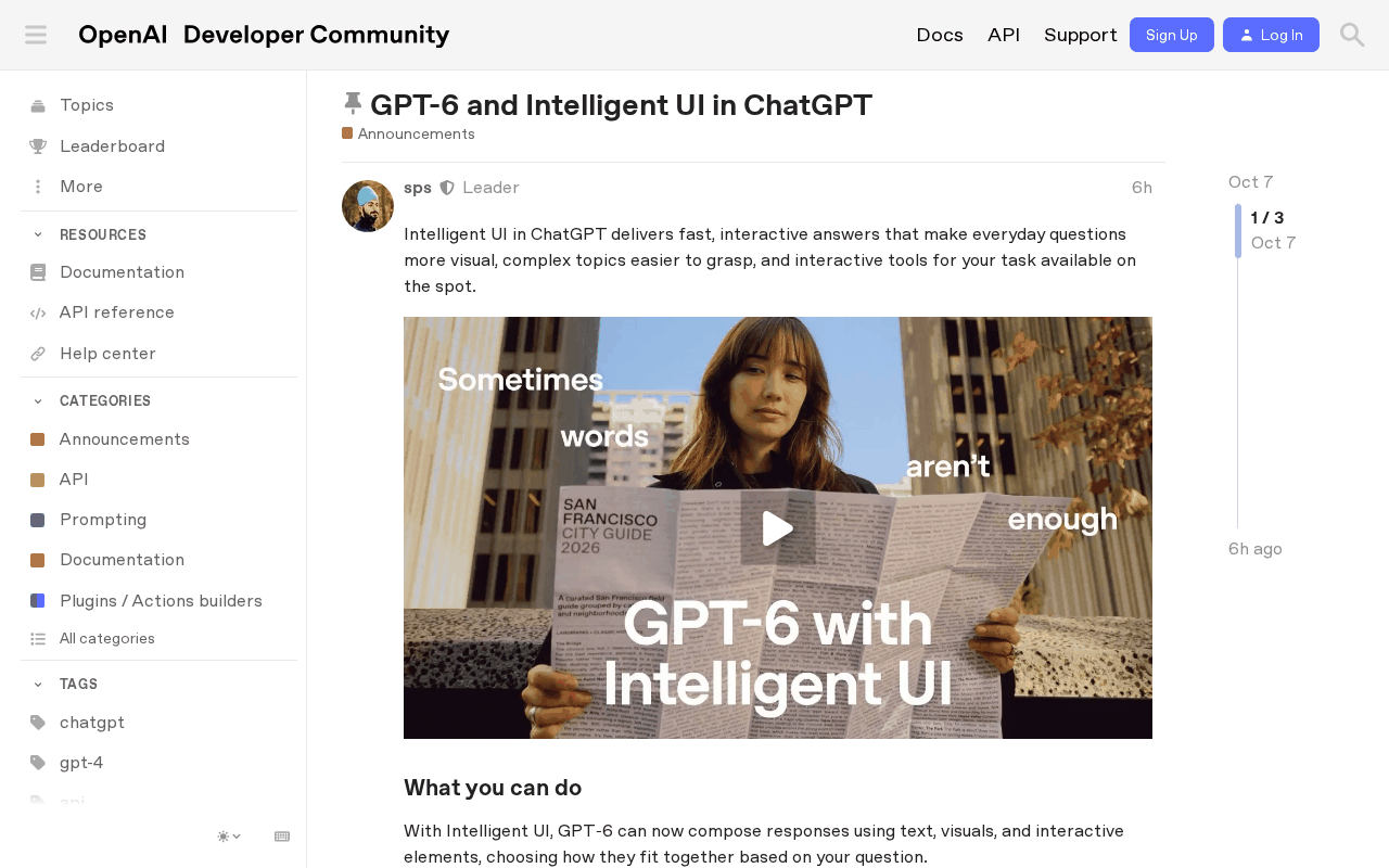 Screenshot: OpenAI Developer Community, “GPT-6 and Intelligent UI in ChatGPT” (Oct 7, 2026), captured Oct 7, 2026.
The rollout runs in two steps. Plus, Pro, Business and Enterprise accounts started on Oct 7, with Enterprise subject to admin settings; Free and Go accounts follow “starting October 8” on GPT-6 Luna rather than GPT-6 Sol, per the community post.
These are the October versions of GPT-6 Sol and Luna inside ChatGPT. They are not the API model gpt-6.1-sol, and nothing in the system card equates the two. Per TechCrunch and the rest of the launch coverage, answers can include charts, diagrams, maps, tappable buttons, forms and on-demand tools such as a bill splitter, all drawn from OpenAI’s own component library.
The limits matter for the register. The Pro thinking level still runs GPT-6 Astra and does not support Intelligent UI, and neither do older ChatGPT desktop apps for macOS and Windows. Search Engine Journal reports a web “Layout and visuals” setting that reduces visuals without removing them. OpenAI’s own concession is unusually frank: “the model’s design judgment and the range of experiences it can create still need work.”
Now what the sources do not say. **No developer surface was announced.** No source we checked through Oct 8, including the community post, mentions the Apps SDK, MCP Apps or API access for these components, and [RuntimeWire](https://runtimewire.com/article/openai-gpt-6-intelligent-ui-chatgpt) notes the release "does not establish a new public interface-building product." Builders cannot target Intelligent UI today.OpenAI’s own announcement page on openai.com could not be fetched (it returned an access error), so this article cites the system card and the community post, which carry the same facts.
OpenAI is not first. Google published its generative UI research on Nov 18, 2025 (Google Research), the Gemini app added interactive simulations on Aug 24, 2026 (Google Workspace Updates), and Claude’s custom visuals arrived on Mar 12, 2026 and are still labelled beta (Claude Help Center). What changed on Oct 7 is reach: the largest consumer assistant began rolling out rendered UI as a default answer shape on every tier.
Why a rendered button is a tool call in a nicer coat
Your current policy probably governs two things: which connectors and tools an assistant may call, and who approves the calls that matter. Both assume the model acts through a typed call that shows up in a log. A button in an answer breaks that assumption quietly. The person presses it, so it feels like their action, but the model chose to put it there, chose its label, and chose what it sends.
Three properties make a rendered control different from a paragraph:
- It invites action without reading. A paragraph that says “you could submit this” asks the reader to decide. A button labeled “Submit” asks them to click.
- Its label and its effect can drift apart. “Save” might keep a draft in the answer, or might send the form contents to a connected service. You find out by testing, not by looking.
- It may not leave a record. If the answer is regenerated or never persisted, the thing a person relied on can be gone by the time someone asks about it.
Three live pieces already cover the neighbors. Stop Trusting the Mermaid treats AI-generated diagrams as claims to check against the transcript and the diff; apply that to every rendered chart here, and take it one step further, because a control that acts is a claim with side effects.
One operating metaphor per surface holds that each surface should mean one thing, so people know what a card can do and who owns its kill switch. An answer that is sometimes a document and sometimes a console breaks that rule unless the register says which it may be. And where AEO classification asks how answer engines classify your product, this register asks how answers render it and whether what they render may act.
The answer-surface UI register, filled in
One row per surface, where a surface is a vendor feature on a specific plan, model and client. The same ChatGPT seat can be two rows: GPT-6 Sol in the Chat tab renders Intelligent UI, while the Pro thinking level on GPT-6 Astra does not. The rows below are illustrative, and “observed” means what your own test prompts produced, not what a vendor promises.
| Surface (vendor feature + model) | Renders interactive UI? | Element classes present | Action elements behind the same gate as a typed tool call? | Evidence (UI persisted or exported?) | Owner | Last re-run |
|---|---|---|---|---|---|---|
| ChatGPT Business, Intelligent UI, GPT-6 Sol (October version), web | Yes | Read-only: chart, map. Input: form (trip budget). Action: “Calculate” button, observed local only | Not proven: buttons not yet tested with a write-capable connector enabled | Screenshot plus conversation link when an answer informs a decision | IT apps lead | Oct 8, 2026 |
| Gemini app, interactive simulation, model as shown in app | Yes | Read-only: simulation. Sliders whose values stay in the render (classed read-only) | No action elements observed | Screenshot of final state; slider values typed into the ticket | Analytics lead | Oct 8, 2026 |
| Claude, custom visuals (beta), workspace default model | Yes | Read-only: inline chart, diagram | No action elements observed | Reportedly not saved separately; export or screenshot | Workspace admin | Oct 8, 2026 |
| Internal support assistant, your component library, pinned model | Yes | Read-only: order timeline. Input: refund form. Action: “Issue refund” button calls the refund tool | Yes: the button emits the same tool call, into the same approver queue | Component payload and tool-call id logged per answer | Support platform team | Oct 8, 2026 |
The fourth row is the one you control fully, and it is the model for the rest. Its button has no private path to the refund system: it produces the same typed call an agent would make, which lands in the same queue, under the same approver, with the same log line. The vendor rows can never be wired that way, because you cannot change OpenAI’s or Google’s component library. For those rows your levers sit around the surface: which connectors are enabled on it, which admin settings apply, and which workflows may run there at all.
The component allowlist and its one rule
Classify every element by where its value goes, not by what it looks like. A slider that only redraws a simulation is read-only. The same slider whose value lands in a submitted form is input. A link is read-only until it carries parameters built from the conversation, at which point it is an action that sends data to whoever owns the URL.
ANSWER-SURFACE COMPONENT ALLOWLIST  v1  (re-run on any vendor UI default change)

class      examples                                        rule on every surface
---------  ----------------------------------------------  ------------------------------------------
read-only  chart, diagram, map, table, simulation whose    ALLOW. No gate. Treat as a claim:
           values stay inside the render                   check it before it informs a decision.
input      form, slider, picker or text field whose        ALLOW ONLY WHERE an approval path exists.
           value leaves the render                         Log: surface, model, fields, destination.
action     button that calls a tool, submits data, sends   SAME GATE as a typed tool call.
           a message, or opens a link carrying parameters  Log: surface, model, tool, args hash,
                                                           approver, time.
unknown    any element class not yet tested on this row    TREAT AS ACTION until a test says otherwise.
Pass or fail is per row. A row passes when every input and action element it renders has an approval path and produces a log line you can find. A row fails when one does not, and the fix is either a gate or a narrower surface, never a note in the wiki.
The log line is where teams cut corners. Make it boring and complete (field names and values are illustrative):
{
  "ts": "2026-10-08T14:02:11Z",
  "surface": "internal-support-assistant",
  "model": "pinned-model-id",
  "answer_id": "ans_8f2c",
  "element": { "class": "action", "label": "Issue refund", "component": "button" },
  "tool_call": { "name": "refunds.create", "args_sha256": "3b9e...", "call_id": "tc_41d0" },
  "approval": { "required": true, "approver": "lead-on-call", "decision": "approved" }
}
Run the register in six steps
1. List every surface where a model answers a person
Start from seats and deployments, not vendors. For each, note plan, client (web, desktop app version, mobile), model and thinking level, because Intelligent UI depends on all of them. Older desktop apps and the Astra-based Pro level do not render it, so two people on the same plan can see different answers. Add internal assistants and any embedded copilot that renders its own components.
2. Test each surface with three prompts per class
Write prompts that invite each class: “compare these two loan offers” for read-only, “help me split this bill four ways” for input, “send this summary to the team channel” for action. Run them on each row and record what rendered. Repeat with a connector enabled, since that is where a button could stop being local. Keep the test set fixed between runs so you compare like with like.
3. Classify by destination
For every element observed, answer one question: does anything leave the render when a person uses it?
If no, read-only. If a value leaves, input. If something is called, sent or opened with parameters, action. If you cannot tell, the allowlist says unknown, which is treated as action.
4. Put input and action behind the gate you already have
“The same approval gate as a typed tool call” means the same queue, the same approver, the same scopes and the same log. Do not build a second gate for widgets; it will be the weaker one within a month. If your queue already strains under typed calls, the tiering in approval queue hygiene is how to add widget actions without teaching approvers to rubber-stamp. On vendor rows you cannot insert a gate, so the gate is the connector’s own confirmation plus your decision about whether that connector belongs on that surface.
5. Decide what counts as evidence
Ask which rendered answers inform decisions: a chart pasted into a board memo, a calculator result used in a quote. For those, require a screenshot or export plus the conversation link at the moment of use. If a vendor does not persist rendered UI, the screenshot is the only record. If you run the surface, store the component payload with the answer id.
6. Name an owner and a re-run trigger
Every row has one owner who re-runs it. The trigger is a vendor flipping a UI default, which is what happened for every Free and Go account on Oct 8. Other triggers: a model version change on the row, a client update, a new connector, or an admin setting such as Layout and visuals changing. Re-run within a week of the trigger and update the date in the last column.
A worked audit: 120 rendered elements, 14 out of policy
Take a 60-person operations team running the four surfaces above. Every number in this scenario is illustrative, not a measurement of any vendor. In the first week after Oct 8, the owners run the fixed test set on each row and log every rendered element: 120 in total.
Seventy-eight are read-only: charts, maps, timelines and simulations whose values never leave the render. They pass by rule. The only follow-up is the evidence habit for the two charts that ended up in a pricing decision.
Twenty-seven are input elements. Nineteen sit on the internal assistant, where every form posts through the tool gate, so they pass. Eight appear on vendor rows with a connector enabled, where the test cannot show what happens to the values after submit. Those eight fail, because “we don’t know” has no approval path.
Fifteen are action elements. Nine are the internal assistant’s buttons, wired to the same tool calls and queue as an agent’s typed calls, and they pass. Six are vendor-rendered buttons the team could not prove stay local once a connector is on. They fail until proven otherwise.
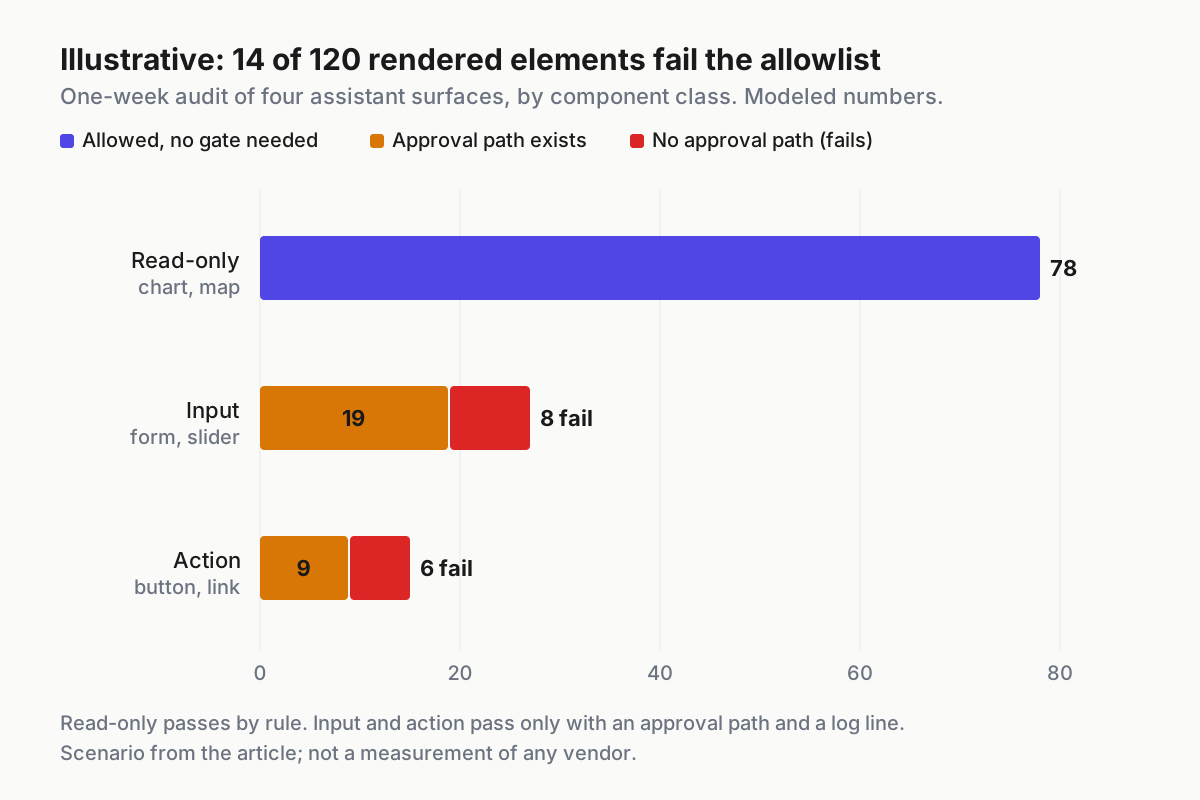
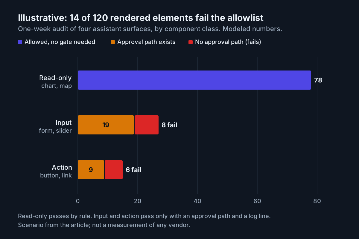 Illustrative one-week audit: all 14 failures are input or action elements without a proven approval path; no read-only element fails.
The fix for the fourteen is not a ticket to a vendor. The team removes the write-capable connector from the two vendor rows, which turns those surfaces back into read-and-draft surfaces, and moves the workflows that must submit data to the internal assistant, where the button and the typed call are the same thing. Second run: 120 elements, zero failures, and two rows whose description in the register changed from “assistant” to “reading surface.”
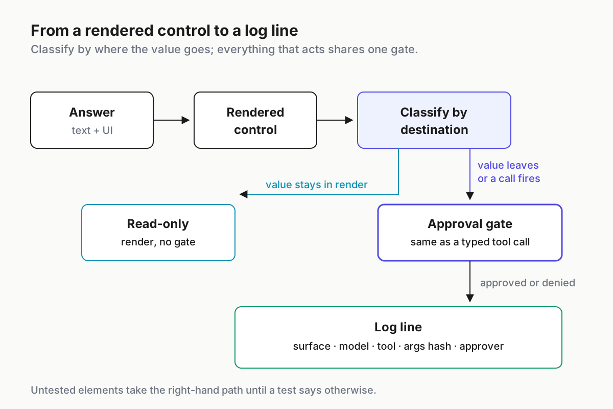
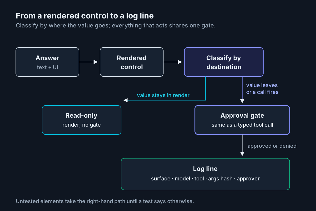 From rendered control to log line: read-only exits early, everything that acts goes through one gate.
Where an answer-surface allowlist leaks
| What breaks | The signal you would see | First action |
|---|---|---|
| A vendor flips the UI default overnight | Help-desk questions about “the new buttons”; register rows dated before the flip | Re-run every row on that vendor within the week; mark untested elements unknown |
| Same seat, two behaviors | One user sees forms; another on the Astra-based Pro level or an older desktop app does not | Split the row by model and client; test each separately |
| A link carries conversation data in its parameters | Outbound URLs with long query strings in proxy logs after assistant sessions | Reclassify parameter-bearing links as action; gate or block that domain |
| A form posts through a connector with no confirmation | Records appear in a connected system with no matching approval entry | Disable the connector on that surface until the path is gated |
| “Layout and visuals” treated as an off switch | Visuals still render after the setting change; the policy says they cannot | Record the setting as “reduces”; keep the row’s allowlist rule in force |
| A chart informs a decision and then vanishes | A memo cites an answer nobody can reproduce or find | Require screenshot plus conversation link at the moment of use |
| Widget actions get a lighter second gate | Approval rate for widget actions near 100%, typed calls lower | Merge into the one queue: same approver, same scopes |
Answer surfaces belong in the fleet’s approval layer
An assistant that answers with buttons is one more actor in the fleet, and it needs what every other actor already has: a row, an owner, a gate and a log. The AgentOps frame puts approvals and audit in the same layer as the agents that act. Rendered controls go there too, not in a separate “chat policy” document that nobody re-reads when a default flips.
The register also connects to two decisions elsewhere in this batch. Which model runs a surface determines whether it renders UI at all, which is why the mode-to-model assignment table pins models per role instead of letting a picker drift. And how agents should see a page, through accessibility semantics or registered tools, is the mirror image of this question; the WebMCP vs ARIA bet covers what you expose to agents, while this register covers what assistants expose to people.
FAQ
What is ChatGPT Intelligent UI?
Intelligent UI is OpenAI’s name for GPT-6 answers in ChatGPT that mix text, visuals and interactive elements such as charts, maps, forms, buttons and tools. It began rolling out Oct 7, 2026 to paid plans and from Oct 8 to Free and Go on GPT-6 Luna. The Astra-based Pro thinking level does not support it.
Can developers build components for GPT-6 interactive answers?
Not as announced. No source for the Oct 7 release mentions the Apps SDK, MCP Apps or API access for Intelligent UI, and coverage notes it does not create a public interface-building product. The components come from OpenAI’s own library. Third-party apps inside ChatGPT remain a separate path with their own rules.
Do interactive AI answers need the same approval as agent tool calls?
Anything that sends data or calls a tool should. Classify each rendered element by where its value goes: read-only elements need no gate, while inputs that leave the answer and buttons that act need the same approval queue, approver and log line as a typed tool call. Untested elements count as actions.
Sources
- GPT-6 Sol and GPT-6 Luna: October 2026 update (system card), OpenAI, Oct 7, 2026
- GPT-6 and Intelligent UI in ChatGPT, OpenAI Developer Community, Oct 7, 2026
- TechCrunch on ChatGPT’s new visual interface, Lucas Ropek, Oct 7, 2026
- Search Engine Journal on GPT-6 and Intelligent UI, Matt G. Southern, Oct 2026
- RuntimeWire on GPT-6 Intelligent UI in ChatGPT, Oct 7, 2026
- Google Research: Generative UI (Nov 18, 2025)
- Google Workspace Updates: interactive simulations in the Gemini app (Aug 24, 2026)
- Claude Help Center: Custom visuals in chat and Cowork (beta; launched Mar 12, 2026 per Claude release notes)